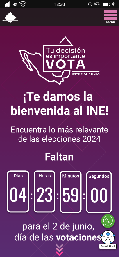
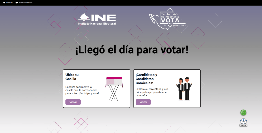
Redesign of the Alternative Page of the INE Portal for the 2024 Elections in Mexico
Introduction to the Design Problem
Una de las encomiendas cuando estuve en el INE como Product Designer fue rediseñar la página alterna. Esta página es importantísima porque se activa durante los periodos electorales para que los usuarios puedan tener acceso a información crucial según el momento de la elección.
My goal was to ensure that the page was not only functional and accessible but also lightweight and fast to guarantee a satisfactory experience, allowing users to find the information they needed quickly and efficiently.
Methodology: Design Thinking in Action
To approach this project, I guided myself with the Design Thinking methodology, carrying out the creative process through its five phases: Empathize, Define, Ideate, Prototype, and Test.
Phase 1: Empathize
User Research and Data Analysis
The first step was to deeply understand the users and their needs. I conducted a thorough analysis of the alternate pages from previous years (2018 and 2021) and specific processes such as the Popular Consultation and the Mandate Revocation. Using Google Analytics, I studied user behavior, identifying patterns and problematic areas.
Key Insights:
- Visits and Loading Time: I identified the most visited pages and analyzed their loading times. For example, in 2018, the homepage and the "2018 Elections" section were the most frequently visited.
- Content Relevance: I detected the need to update the content with real information instead of placeholder text, thereby improving the site's usefulness and relevance.
Phase 2: Define
Identified Problems and Opportunities
With the data collected and the understanding gained from users, I defined the problems to be solved:
- Accessibility and Usability: It was necessary to improve the accessibility of critical information, such as polling station locations, credential status, candidate information, and their proposals, as well as information about the Preliminary Results Program (PREP).
- Content Load: The content saturation needed to be reduced to improve page loading speed.
- Interaction and Engagement: User interaction also needed to be increased, which would be achieved with an intuitive design and very clear calls to action. También se necesitaba aumentar la interacción del usuario, esto se lograría con un diseño intuitivo y llamados a la acción muy claros.
Phase 3: Ideate
Generating Solutions and Proposals
In this phase, I generated various ideas to address the identified problems. I held brainstorming sessions with the architecture team, and together we considered the necessary elements in the interface for both mobile devices and desktops.
Key Proposals:
- Modular Interface: Design a modular interface that allows dynamic changes in content according to the stage of the electoral process.
- Call to Action: Include buttons and links with clear, simple, and direct calls to action.
- Improved Accessibility: Use icons and help bubbles to explain technical terms and facilitate navigation.
Phase 4: Prototype
Creation of Wireframes, Prototypes, and Flow Diagrams
My favorite part, creating wireframes with the suggested elements, and then, in a second stage, the prototypes.

View mobile prototype | View desktop prototype
(Password: PREP_pef_2024)
- Elementos ConstantesConsistent Elements: I ensured that information about polling station locations and candidate details remained always visible and accessible. I replaced all placeholder text with real and relevant information so that users could quickly evaluate its effectiveness.
- Information Hierarchy: I concluded that a clear hierarchy was essential. Therefore, I used different font sizes and styles to separate the information so that technical terms and processes could be easily explained and not be confusing.
- User Interaction: I thought about how to make it easier for users to find information. For this reason, I designed interactions that simplified locating polling stations and accessing candidate information, promoting electoral participation.
Prototype Elements:
- Intuitive Navigation: I ensured that the flow diagram showed clear and accessible navigation, guiding the user through the most relevant information at each stage of the electoral process.
- Visual Design: I concluded that it was crucial to maintain a well-defined visual hierarchy. So, I designed the prototypes so that key content elements were always visible and accessible according to the timing of the election. All placeholder text was replaced with real and useful information to maximize effectiveness.
Phase 5: Test
User Testing and Refinement
To ensure that the implemented ideas truly met user needs, I conducted user tests. I made sure to gather valuable feedback to understand what worked well and what aspects we needed to adjust to optimize the experience.
Test Results:
- Clarity and Understanding: I realized that users found it easier and faster to access critical information. 75% of users experienced a more intuitive navigation, and 80% rated their experience as satisfactory.
- Improved Interaction: I also noticed a significant increase in interaction with key page elements, such as the search for polling station locations and candidate information. This confirmed that the changes made truly enhanced the usability and appeal of the page for users.
Final Results and Conclusion

>> Navigate on the Alternate Page by clicking here <<

