Development of the "Help Center" Platform at INE
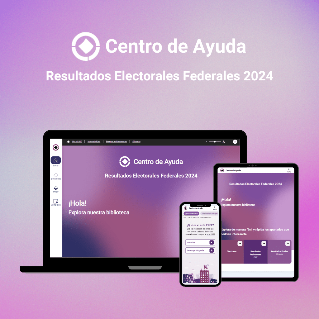
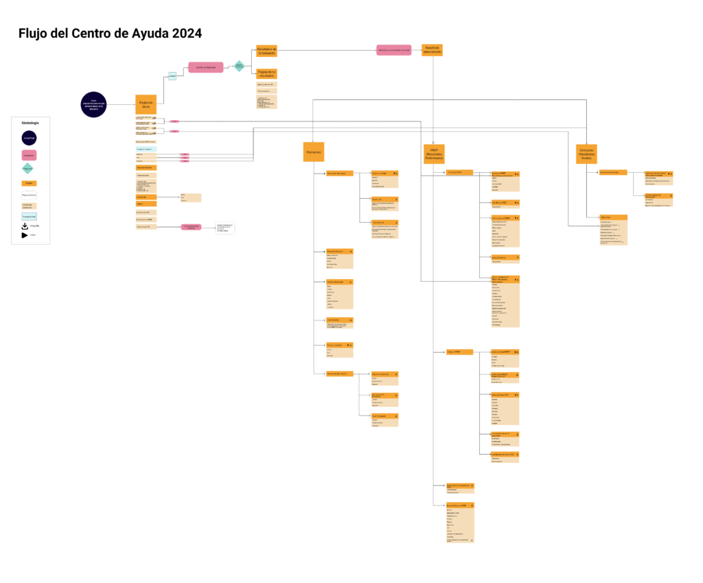
Otro de los proyectos en los que trabajé en el Instituto Nacional Electoral (INE), fue el rediseño del “Centro de Ayuda” del INE, una plataforma diseñada para dar ayuda a los usuarios durante el proceso electoral. Aqui mi objetivo como Product Designer fué ayudar a los usuarios a comprender detalles y conceptos bastante complejos que se usaron en las elecciones.
Objectives
The idea behind creating the "Help Center" was to simplify all electoral information for people who needed to easily understand aspects such as elections, voting, regulations, PREP, and computations, among other similar terms. However, I also wanted to create a platform that went beyond just providing information but could also connect with people from a closer and friendlier approach; this was the main challenge.
Phase 1: Research and Benchmarking
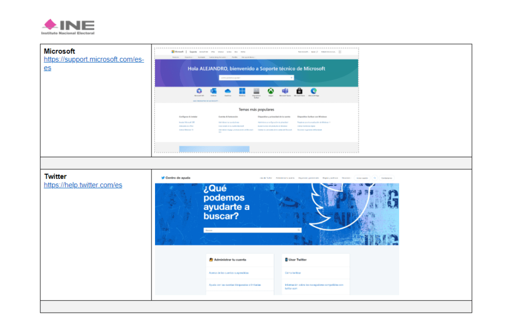
To start, I conducted research on websites from both public organizations and private platforms. These sites included SAT, INFONAVIT, IPN, WhatsApp, Microsoft, and Twitter. I paid special attention to the menus, content, navigation, and how elements were distributed and navigated. This deep dive allowed me to identify adjustments that impacted user experience and, subsequently, consider how to apply them in creating the help center.
Phase 2: Response Analysis and Card Sorting
It was important to understand what users were wondering while navigating the PREP, so I conducted guerrilla testing to comprehend the main concerns and needs of users. From this, very interesting topics emerged, such as transparency in the electoral process, the dissemination of results, and the authenticity of the records.
With the questions ready, I conducted a card sorting exercise to understand how users organize information. This exercise was extremely helpful, as it allowed me to create essential categories like Inform Yourself, Transparency, Voting Alternatives, Elections, Preliminary Results, and Final Results.

Phase 3: Prototype Creation
This is the sexiest part of the project: creating the prototypes for the new site.
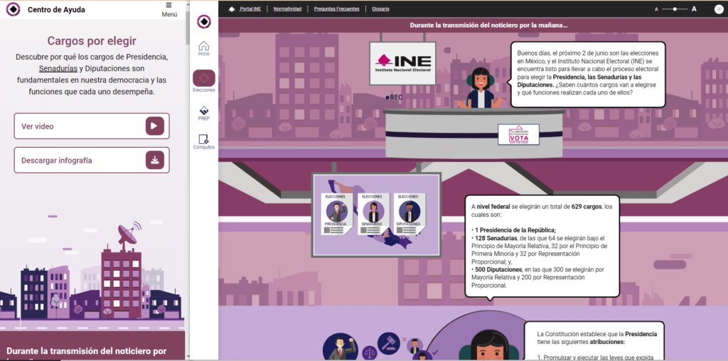
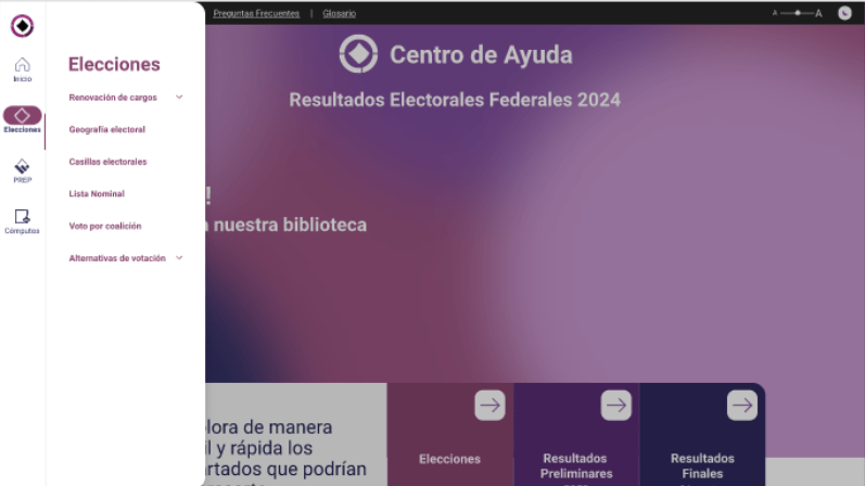
As I mentioned at the beginning, I wanted to move away from a traditional help platform and create something more approachable and friendly. A brainstorming session with the information architecture team later led me to think about designing the help site with a comic style, where everyday situations offer the opportunity to visually explain complex topics in an accessible language. That’s how I met with the design team to create stories that would help users understand key concepts without feeling overwhelmed and then went on to create the prototypes.
Phase 4: Evaluation and Adjustments
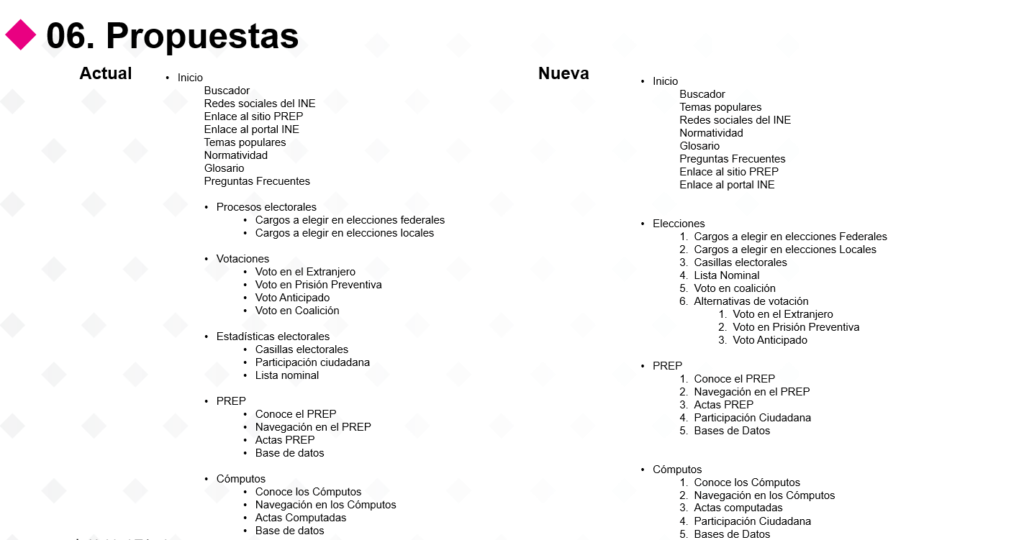
Once the prototypes were created, it was important to know if they were easy to navigate. For this, I conducted usability tests. The results of these tests showed that 75% of users found the navigation intuitive and 80% rated their experience as satisfactory, indicating that we are on the right track. The most interesting part of this was that some users shared improvement ideas for organizing the categories to clarify terms. With their feedback, I reorganized the site's architecture, reducing the number of categories.
Phase 5: Implementation of the Help Center
After applying the necessary adjustments, the "Help Center" platform was launched in June 2024, helping thousands of users who were seeking information during the electoral process.
Phase 6: Feedback
Key Data:
- Loading Times: Less than 3 seconds in 95% of interactions.
- User Satisfaction:: El 85% calificó su experiencia como “muy buena” o “excelente”.
- Ease of Navigation: 80% of users found the navigation easy to use.
- Recurring Comments: Suggestions for improved data visualization and greater customization of information.
Suggestions Received:
- Optimization of Data Visualization: Improve the clarity and accessibility of graphs and tables.
- Personalization of Results: Allow users to customize how results are presented, based on their preferences and needs.
- Increased Accessibility: Ensure the platform is fully accessible to users with disabilities.
Conclusion
Working on the INE's "Help Center" taught me that design goes beyond aesthetics; every decision must have a clear purpose and address real problems for users. I realized that simplifying complex concepts can make a difference in how users feel when using a platform. Seeing that users felt more secure and less lost while using the new version of the Help Center confirmed that we were on the right path.
This project reaffirmed my commitment to always design with intention and empathy, putting users at the center of every decision. And the most valuable lesson I take away is that good design not only solves problems but can also transform complicated experiences into something clear and friendly.
>> Explore the PREP Help Center by clicking here <<

