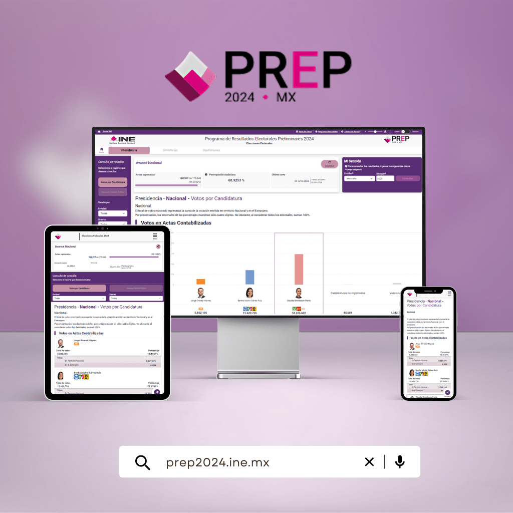
Redesigning the PREP 2024
En el tiempo que estuve en el INE, trabajé en el equipo de arquitectura de información como Product Designer para ayudar a rediseñar la plataforma del Programa de Resultados Preeliminares (PREP) y mejorar cómo los ciudadanos pueden acceder a los resultados de las elecciones en tiempo real.
PREP is an electoral platform that publishes reliable election data in Mexico directly from polling stations, making it accessible to everyone.
Research
1) Surveys
To better understand user experiences when using the PREP and to have a clearer picture of their perceptions, I conducted 265 surveys with people interested in accessing electoral data, with the following objectives:
- Understand how they search for and find electoral information on the PREP.
- Identify which parts of the PREP they find most useful or interesting.
- Discover areas where the portal can improve and become more user-friendly.
Key Data:
- Who participated? 51% of the respondents are between 31 and 43 years old. The majority are women (174), followed by men (89), and 2 identified as other.
- How do they get informed? 39% use the INE website to check electoral results. Others prefer social media (27%), radio or television (27%), newspapers (4%), or they find out through family or friends (3%).
- Use of the PREP:: 170 people surveyed did use the PREP to check the results, while 95 did not. Of those, 48 were not familiar with the site, meaning that 18% of the respondents do not know what the PREP is.
2) Analysis of similar websites
I wanted to see how other electoral results platforms were handling the user experience when searching for relevant information, so I decided to analyze different electoral institute websites to compare their features and ease of use, and also to get some ideas.
GERMANY
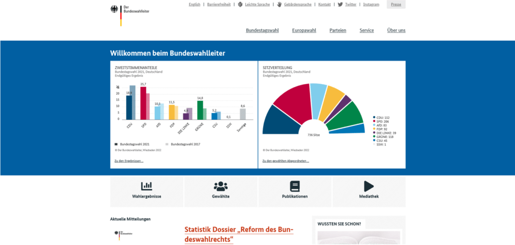
What makes this site stand out? A fixed menu always visible, data organized clearly, intuitive graphics.
Pros:
-
-
- Well-presented data: The graphics are well-organized in separate containers, which makes understanding the information easier without it appearing cluttered or confusing.
- Always visible menu: Having a fixed menu visible makes navigating the site simpler and quicker.
- Efficient organization: Each element has its own space, preventing the user from feeling lost or overwhelmed.
-
Cons:
-
-
- Optimizable spacing: Although the organization is good, the spacing between elements could be optimized to further enhance the visual experience.
-
AUSTRALIA
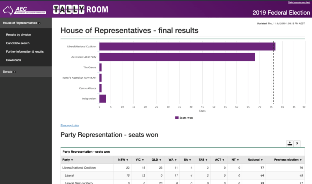
What makes this site stand out? Use of tabs and filters, visual consistency, efficient use of space.
Pros:
-
-
- Easy navigation: Tabs and filters make moving between different sections seamless.
- Visually coherent: Maintains a consistent style in terms of fonts and colors, making the site easier to read and understand.
- Good use of space: Utilizes the full width of the screen intelligently, avoiding both saturation and unnecessary empty spaces.
-
Cons:
-
-
- Side menu not suitable for everyone: For some users, especially those accustomed to using top menus, the side menu may be less intuitive.
-
DENMARK:
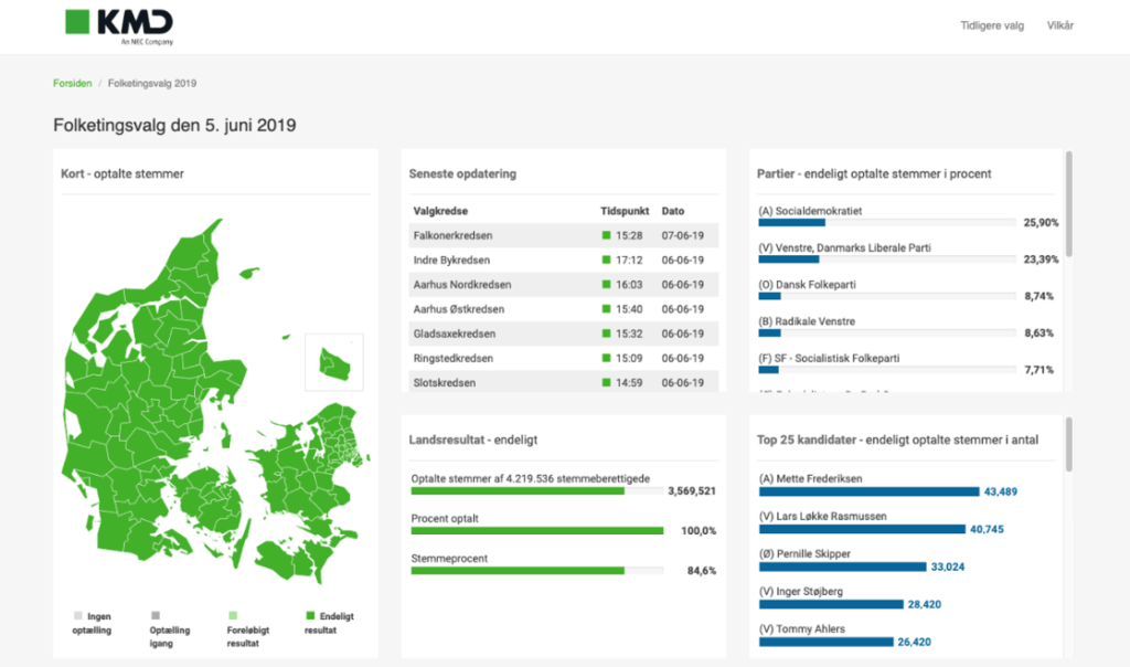
What makes this site stand out? Use of lists instead of complex menus, focus on simplicity.
Pros:
-
-
- Simplicity in navigation: A simple list makes it easy to quickly find what you're looking for, without the need for multiple clicks.
- Clarity in presentation: Avoids information overload, which is great for users who only want basic data.
-
Cons:
-
-
- Lack of depth for advanced users: It may fall short for those looking to explore more specific or detailed data.
-
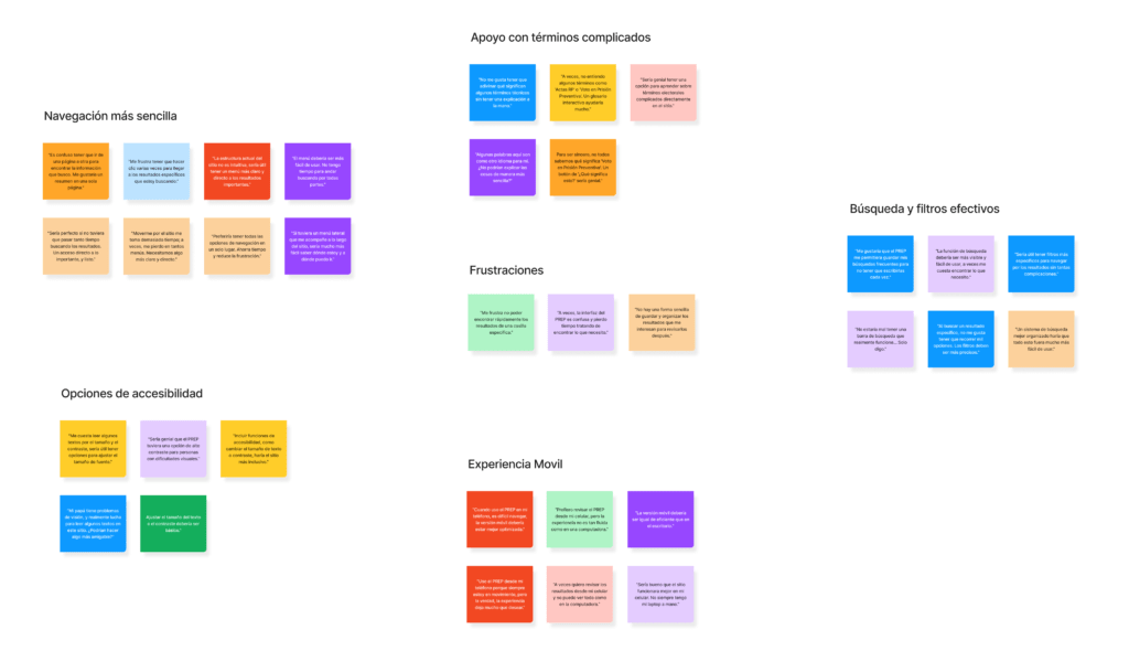
3) Affinity Map
Now that I have gathered information from users and similar portals, I created an affinity map to uncover the most common issues I found. This map was key in guiding the redesign of the PREP.
.
The Problem
These were the problems I was able to identify:
Confusing navigation
- Users need to know exactly what they are looking for from the start, which limits spontaneous exploration and creates frustration.
- The site's structure is not intuitive, forcing users to make multiple clicks to find the desired information.
Lack of familiarity with electoral terms
- Many users do not understand specific terms such as "RP Acts" or "Vote in Preventive Custody," creating comprehension barriers.
- The lack of clear explanations generates confusion and makes the site harder to use.
Inefficient filters and search
- The search function and filters are neither clear nor easy to use, complicating result refinement.
- Users have trouble quickly locating the specific information they need, which increases frustration.
Lack of accessibility options
- The site lacks accessibility features, such as contrast adjustments.
- There are no options to adjust text size, which affects users with visual impairments or reading difficulties.
Poor mobile experience
- The mobile version of the site is not well optimized, making navigation on mobile devices difficult.
- Users who prefer to access the PREP from their phones or tablets encounter limitations and a less smooth experience.
Defining the problem
To continue with the design, I focused on this guiding question:
How can we simplify navigation so that everyone, regardless of their knowledge of electoral terms, can easily find the information they are looking for?
User Personas
Although I had valuable information, there was still a crucial part missing: thoroughly understanding the users' context, along with their preferences, the problems they face, and their behavior when using the site, in order to make a more targeted and effective redesign of the PREP. So, based on previous research, I created profiles that represent the ideal users of the PREP.
Ideation
Developing the Solution
Great! I could start imagining solutions related to five key areas where the PREP could improve: Navigation sometimes feels confusing, there are electoral terms not everyone understands, the search and filters don't always help as they should, there are missing accessibility options, and the mobile version needs some adjustments.
To resolve this, I had a few ideas:
- Simpler navigation: Moving around the site should be more intuitive, with clearer menus and direct access to what matters most. The idea is for users to find what they are looking for with fewer clicks.
- Support with complicated terms: Providing simple and accessible explanations for more complicated electoral terms would help ensure no one remains confused while using the platform.
- Effective search and filters: Improving the search function by keeping it always visible, along with filters that are easier to use, would help users get to where they're searching without hassle.
- Accessibility options: By including features like text size adjustment and higher contrast, all users, regardless of their needs, could comfortably use the PREP.
- Better mobile experience: Optimizing the site to look and function well on any mobile device. We want navigating the PREP to be as easy on a phone or tablet as it is on a computer.
User Flow
I created a user flow to illustrate the different paths users might take while navigating through the screens designed for the redesign, highlighting possible scenarios they might encounter along the way.

Lo-Fi Wireframe
With all the pieces in place, I was able to bring the solutions I had thought of to a physical plane, creating paper wireframes as a preliminary step for the platform redesign.
- Simplified navigation
- Interactive user journey
- More effective search and filters
- Accessibility options
- Better mobile experience
Mid-Fi Wireframe
After generating low-fidelity sketches, I moved to Figma to create the structural design.
- Simplified navigation
- Interactive user journey
- More effective search and filters
- Accessibility options
- Better mobile experience
Hi-Fi Wireframe
Important Redesigns
Simplified navigation

1) Clearly labeled menus: Located at the top and left side of the page, which helps users quickly find important sections like "Presidency," "Senate," and "Chamber of Deputies."
2) Organized and accessible side menu: Displays clear and organized options such as "Votes by Candidacy" and "Votes by Political Party," allowing users to quickly select the type of information they want to consult.
3) Clean and structured design: The page uses well-defined and organized spaces, which reduces visual clutter and makes it easier for users to find the information they are looking for.
Help to understand complex terms
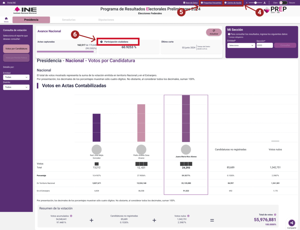
4) Centro de Ayuda Integrado4) Integrated Help Center: A direct access to the "Help Center" was added in the top menu to provide detailed explanations of complex terms.
5) Frequently Asked Questions (FAQ) Section: A visible section in the top menu with answers to common questions about terms and procedures, enhancing user accessibility and understanding.
6) Links to Additional Resources: Includes links to additional resources such as downloadable infographics and explanatory documents that help users better understand the meaning of specific terms and electoral processes.
More effective search and filters
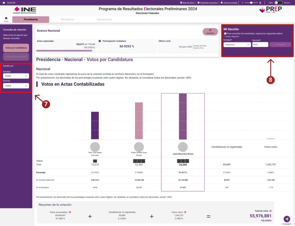
7) Clear and Customizable Filters: More detailed and customizable filters have been added, allowing users to refine their search by categories such as "State," "District," "Type of Election," and "Result by Candidacy," making the search more intuitive and specific.
8) Results Personalization: "My Section" allows users to directly enter the state and section of interest to quickly access the specific results they want to see, customizing the experience according to their needs.
Accessibility options

9) Light/Dark Mode: A toggle button has been incorporated to switch between light and dark mode, allowing users to select the screen contrast that best suits their visual needs. This option is especially useful for people with light sensitivity or those who prefer a specific reading environment.
10) Text Size Adjustment: Options are included to increase or decrease the text size, making the information more accessible for users with visual impairments or difficulties reading small fonts. This allows for a more comfortable and personalized reading experience.
Better mobile experience
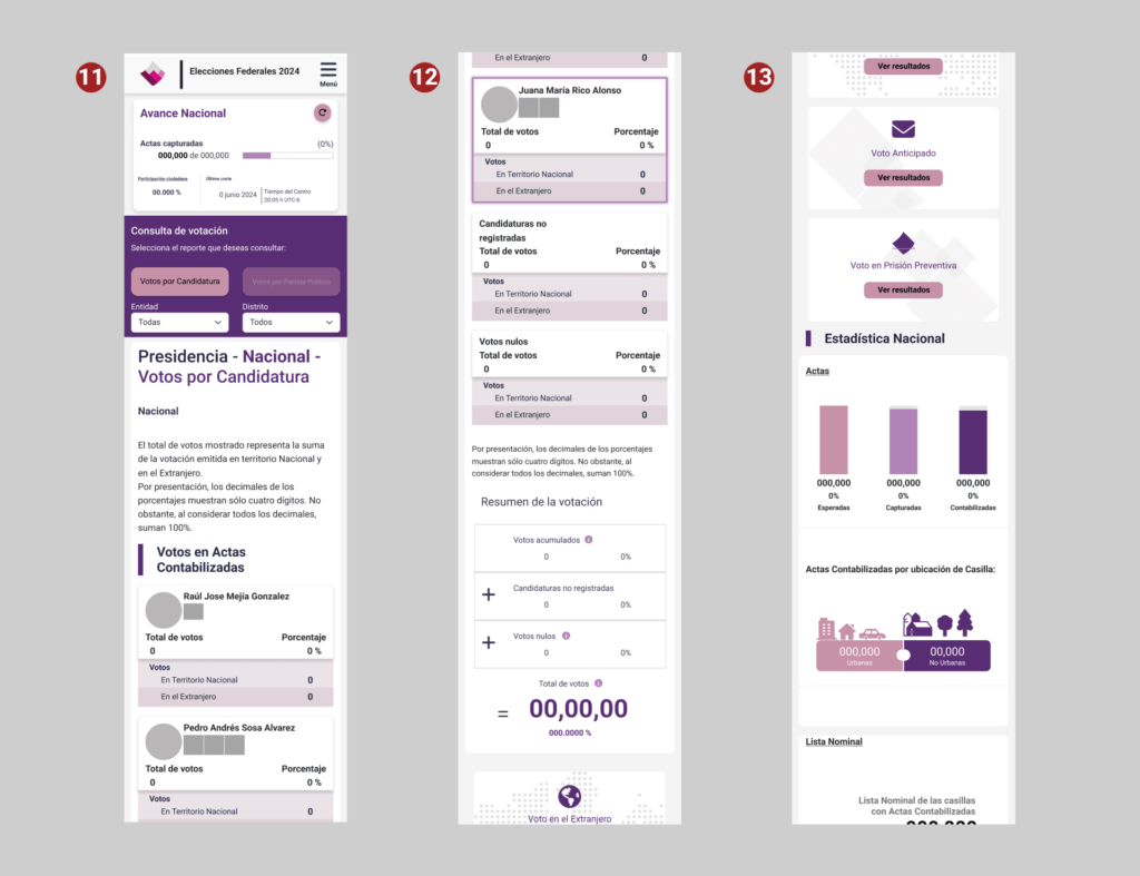
11) Responsive Design: The page automatically adapts to the size of the mobile device's screen, ensuring that key elements, such as menus and navigation options, are accessible and visible without the need to zoom in or scroll horizontally. This facilitates a smoother and more comfortable navigation experience for mobile users.
12) Simplified Interface: The mobile version presents a cleaner interface with less visual clutter. Elements are rearranged to prioritize the most relevant information, such as electoral results and filter options, allowing users to quickly find what they are looking for.
13) Optimization of Graphics and Tables: The graphics and results tables have been optimized for mobile devices, displaying essential data clearly and allowing users to view the information without issues. The graphics now automatically adjust so they don't get cut off on smaller screens.
The Launch!
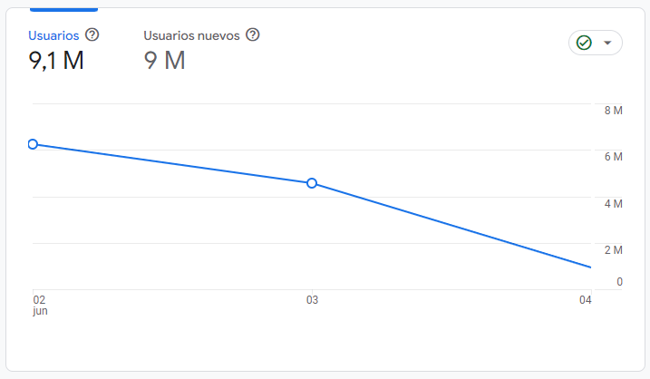
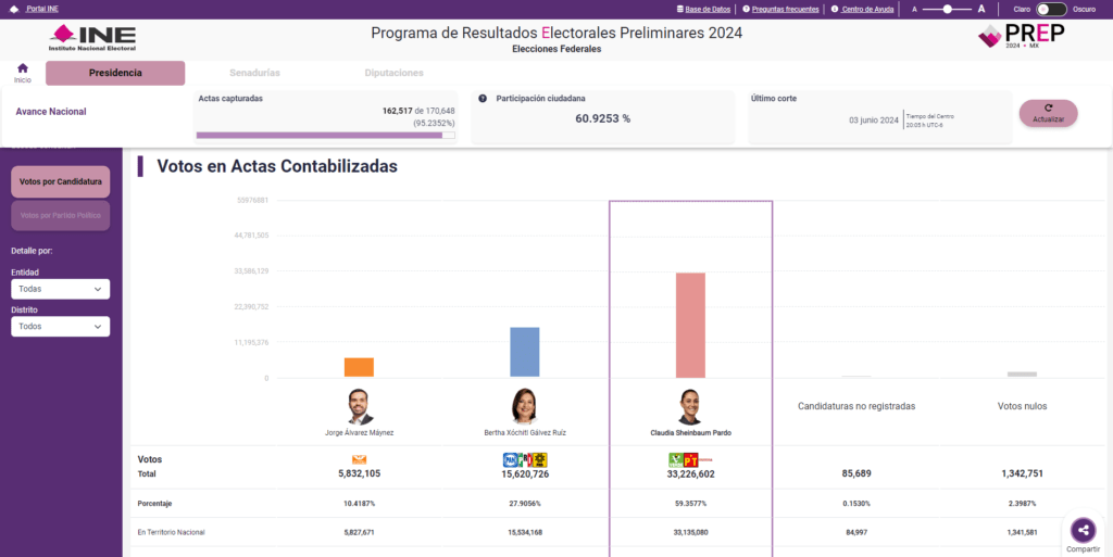
The day arrived, and the PREP was officially launched on June 3, 2024, attracting a large number of users who wanted to know the results. According to Google Analytics, the platform received over 9 million users worldwide.
Update:
It has been a few months since the PREP was launched, and it has been a significant success, providing millions of citizens easy and quick access to the preliminary election results. The idea is to continue refining and improving the platform based on the feedback received to ensure it continues helping people stay informed about the electoral process results in the best possible way.
>> Navigate to the PREP site by clicking here <<
Next Steps
These improvements are just the beginning of making the platform more intuitive and accessible in this and future editions of elections in Mexico. The next steps I am considering are:
- Explore additional accessibility options: I will propose adding more accessibility features, such as optimized screen readers and translations to indigenous languages, to ensure the platform is inclusive and useful for all demographic groups.
- Develop interactive tutorials: To help users familiarize themselves with the platform and its functionalities, I am considering creating interactive tutorials or explanatory videos that guide users in using the platform effectively.
Additionally, considering how to keep users engaged and further enhance their experience, it is important to consider integrating personalized notifications that alert users about result updates or important changes in real time. This would help make using the platform more interesting.
Conclusions
Working on this project, especially with such a limited time frame, was a challenge, but it taught me many valuable lessons. It allowed me to immerse myself in the experience of PREP users and discover how to make checking an electoral result not a headache.
At the end of the day, it's not just about making a site easier to navigate or simplifying complex terms; it's about truly understanding the people who use it, putting yourself in their shoes, and finding ways to ensure the information they need is clear and easy to find. It’s incredible how small changes can make a big difference in how people feel when using a tool.
I love seeing how each project gives me the opportunity to connect more deeply with users and learn something new about their needs and expectations. This more personal and human approach to design is what motivates me to keep going, to keep exploring and improving. I am committed to making the user experience more than just functionality; I want it to be an experience that truly connects with people and makes their lives easier.

